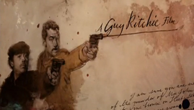
Ah, Sherlock Holmes. I love it. The books, the old movies. I especially love the two new steampunk films. For me, the very sweet eye-candy of both pictures (aside from Downey and Law) includes the care and detail with which the film credits have been developed.
The sequences built by creative director Danny Yount and his team were purely brilliant. They are a cross-pollination of illustration, photography, cinematography, prepress, old type and paper. They all fade in and out from one another like a dream diminishing as you wake into reality.
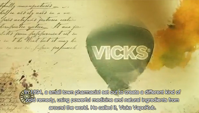
This week, I saw a Vicks commercial that used exactly the same method. Are you kidding me? Those beautiful techniques are now used to kill my cough with honey? I choked. But then I pondered….
Isn’t examining a bit of code or a type treatment, and then adjusting it into your own design the same thing? It’s not plagiarism if you can figure out how a photo treatment was applied and then apply it, is it? That’s imitation. Isn’t imitation the purest form of flattery?
The Merriam-Webster’s definition of flattery is “insincere or excessive praise.” While I don’t think the Vicks spot plagiarized the film’s credits, it was flattery. It was insincere because it swiped a technique instead of creating a commercial that felt like the Vicks brand. It was excessive, because it feels over-the-top for cough syrup. After all, Vicks is not a legend like Holmes, my dear Watson.
Watch the Sherlock Holmes end credits then the Vicks spot and decide for yourself. To see how Danny’s team did it, if you want to flatter them, too, visit Art of the Title.


