Last week on Compositions, I featured my new Church Hill Association (CHA) and neighborhood brand and website. Today, let’s chat about expanding a brand.
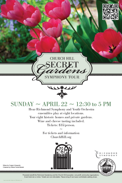
On April 22nd, my neighborhood is hosting a lovely springtime event called the Secret Garden Symphony Tour–visitors can tour private gardens and listen to Richmond Symphony ensembles all over The Hill. I’ve been helping with the design of materials to support the event. Having just completed the neighborhood brand, I went back to the new CHA brand standards. We have fonts. We have colors. We try to include color photography when possible. So when it came to building the Secret Garden materials, I had only to build an event-specific logo, and then simply apply the graphic standards.
I viewed the standards not as restrictive, but as a springboard to give me a starting point for the creative for this event. As a result, my probono job was simplified because I wasn’t having to make basic font, color or layout decisions all over again. For Church Hill, the Secret Garden materials look consistent with the CHA website and other collateral, enabling viewers to more easily recognize who we are. They’ll see our brand expanded on our website and now through the collateral for this event collateral: in publications, on banner ads, posters, flyers, tickets, and of course on the CHA site where you can purchase tickets.
As a designer, how do you view brand standards? As a help or a hindrance?

