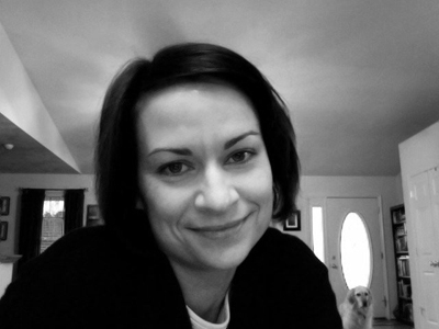
My guest today is Suzanne Kamata, a novelist and short story writer. She has come to chat about writing, and where the inspiration for her stories originates:
People often ask me how much of my writing is autobiographical. Although I would prefer that readers marvel at my fertile imagination, the honest answer would be that all of my writing is autobiographical, in that it reflects my interests and obsessions. Ideas for stories come from a variety of sources—my daily life in Japan, motherhood, folk tales from traditional cultures, newspaper headlines, travel, lives of the saints, and conversations with others. I keep a clip file of images and articles cut from magazines and newspapers for inspiration.
My story The Rain in Katoomba began with the title. My husband and I took a trip to the Blue Mountains of Eastern Australia several years ago. I was interested in this area because I knew that many artists had settled there. We’d heard that the Three Sisters, a rock formation in Katoomba, was a “must-see,” so we added it to our itinerary. Unfortunately, we had only a long weekend in Australia and the day of our outing was misty and rainy. We stood at the edge of a canyon and saw only fog. “The rain in Katoomba,” I muttered to myself. This ultimately led to a story about an elderly Japanese woman who goes for a walk in the rain and loses her way while absorbed in memories of her youth in Katoomba with her wannabe-artist father. I wove in an aboriginal tale about the formation of the Three Sisters, the rock formation that I never actually got to see in person.
I created a Pinterest inspiration board for my short story collection (which includes the story, The Rain in Katoomba), and I’ve created boards for my other books as well.
Suzanne was born and raised in Grand Haven, Michigan. She is most recently from Lexington, South Carolina, and now lives in Tokushima Prefecture, Japan with her husband and two children. Her short stories, essays, articles and book reviews have appeared in over 100 publications and her work has has been nominated for the Pushcart Prize five times. She is a two-time winner of the All Nippon Airways/Wingspan Fiction Contest.

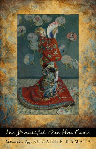
![Suzanne_Kamata_thumb[1]](http://www.karenachase.com/wp-content/uploads/2012/11/Suzanne_Kamata_thumb1.jpg)
