featured artists

First Friday: Matt Flowers’ Landscapes

A Matt Flowers Landscape

Imagine a mountain top. Way up high. With old craggy rocks springing forth with glorious evergreens reaching for the sun. The above artwork is part of a collection by Richmond artist, Matt Flowers. But all is not as it appears. It is not a photo of place. It’s a place created by Matt that and your interaction with it makes you feel huge while at the same shrinking you in an Alice in Wonderland kind of way.

Using driftwood, rocks, moss, enamel, paint and detailed hand work that is surely going to give him early-onset crows-feet, Matt is a sculptor of landscapes that are driven by his photographic eye. In taking pictures of Matt’s work for this post, I quickly realized I was not capturing one of the most essential and remarkable elements of his sculptures. Scale. So I included a frame of reference to help you comprehend the size through a series of images.

Using the found elements and adding in tools like magnifying glasses and backlit screens, Matt engages the viewer to discover life-like imaginary worlds. Some of his pieces use antique lenses tucked into handcrafted boxes mounted on vintage tripods to create small dioramas that make the viewer feel as if they’ve dropped into an H.G. Wells-like world where nothing is as it appears. His tiny details create landscapes that upon closer inspection feel larger, giving the viewer a magical glimpse into another place both of this world and of Matt’s imagination.

This gallery of images of his sculptures better explains the work, and for more information visit Matt Flowers’ website.

Posted in Blog | Comments Off on First Friday: Matt Flowers’ Landscapes

First Friday: Gregory C. Randall


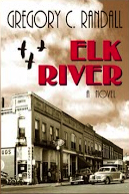
This month’s featured artist is an urban designer, graphic designer, illustrator and  prolific writer. Gregory C. Randall shared some insights about his writing and his latest book, Elk River which was just selected by the Independent Book Publishers Association and its Benjamin Franklin Awards as one of the three best books in the LGBT category.

How much do you write, and what’s your process?
I try to work two hours a day, up at 5:30, 12 cup coffee maker bubbling, fingers poised. A thousand words is my goal, but when I’m hot I can get 1500. My blogs help sharpen my pen and my style, they go about 1800 words every week. That’s about 7000 words a week, and I have published five of my own books so far. I have been a practicing landscape architect and urban designer for forty years, and designed hundreds of communities and projects from housing to high tech. Each is a process with a beginning, middle and conclusion. It’s easy to look at writing as the same process.

What is it about each story that compels you to write it?
I’m not a stylistic writer like Pat Conroy or others, but the idea of crafting a story that engages a reader intrigues me and to be honest, is a lot of fun. If I can entertain that’s my goal.

What do you hope readers take away from Elk River?
A sense of timelessness. Howie’s story is not unique, families are faced with huge troubles and for the young it can come at them hard. Also a sense of wonder. City kids miss a lot of the softness and hardness of nature. It’s also the times (1950s) and the migrants, the medical care, the lack of anti-depressants, the issue of culture and smoking, and of course homosexuality. Some are verboten now, others were then, but times do change and the reader begins to understand the complexities of even simple societies. I hope.

Trying to do Gregory’s work justice in 250 words is darn near impossible (and I failed). So you’ll have to flip over to one of his many sites, blogs or buy Elk River and find out just how prolific and talented he is.

Greg C. Randall Website
Writing4Death Blog
Elk River Blog


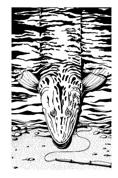
Gregory also created the illustrations, like this one of a muskrat, for the book Elk River. Of course he did!

A book trailer for Girl Unmoored

Debut author, Jennifer Gooch Hummer, recently worked with me to build a new book trailer for her YA novel, Girl Unmoored. Her novel has been garnering all kinds of awards (see the list below), and so Jennifer was ready to produce a mini-movie about the book. The trailer needed to give an overview of the story, match her book cover and author website, and also showcase a couple reviews and awards.

To find out more about her story, watch the Girl Unmoored book trailer

To build the trailer, first I read the book! Her main character, Apron, has a funny yet very moving way of viewing the world, so we knew the text had to not only match the book marketing, but Apron’s tone of voice. Working with the artwork and fonts from the book cover, I also added a couple videos and music to help it feel like 1985, the time period of the story.

So today Jennifer launches her new book trailer and announces her collection of fabulous awards. Congratulations!

Jennifer’s awards include:
Cross Genre, National Indie Excellence Book Awards
Best YA Fiction, Paris Book Festival
Best Teenage Fiction, San Francisco Book Festival
YA Fiction, and finalist for Best Cover Design and Chick Lit
Next Generation Indie Book Awards
Finalist for YA Fiction and Best New Fiction, International Book Awards

“Love, loss, and the coming of age of one remarkable girl blaze through this haunting debut like a shooting star you’d wish upon. It’s tough and tender, funny and smart, and it frankly took my breath away. I loved it.”
– Caroline Leavitt, New York Times bestselling author, Pictures of You

“…infused with love and punctuated with wry good humor… Apron may be adrift, but Hummer’s debut is on track.”
– Publishers Weekly


Posted in Press | Comments Off on A book trailer for Girl Unmoored

First Fridays: Bonjour “Paris in Color”

This month’s First Friday artist sticks with the Bonjour Paris theme: Nichole Robertson is another writer, photographer and Parisian-lover. She has a delightful book out called Paris in Color. Yes, Paris is definitely photograph-able. But Nichole takes it to a lovely work of art level by gathering her images together by color.

Before she moved to Paris for a year, she began a site called Little Brown Pen. The name and the site are adorable and it links you to the book, a bit of info about Nichole and the photography collection she dubbed “The Paris Color Project.” After moving to Paris, she would head out with her camera, and when a colorful item grabbed her attention, she’d take photos of that color for the day. As she says in the book, “Nothing sharpens your senses like a new address.”

Upon returning home each night, she’d post the colorful images. Now those images can be found in her book. They can also be found in The Paris Print Shop. It’s a site Nichole and her husband set up to sell the images, postcards and more. And her work has gone on to be featured by Martha Stewart, Real Simple, and The New York Times among others.

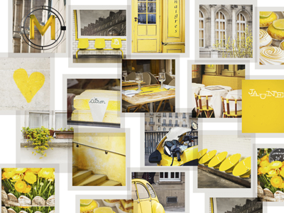
Are you green with envy for that little Vespa you saw near the market? Now you can own a collection dedicated to the color. Are your skies gray because you miss Paris terribly. Or perhaps yellow is how you are feeling today. This yellow image is downloadable for your desktop wallpaper from her publisher’s facebook page at Chronicle Books.

It’s elementary flattery.

Ah, Sherlock Holmes. I love it. The books, the old movies. I especially love the two new steampunk films. For me, the very sweet eye-candy of both pictures (aside from Downey and Law) includes the care and detail with which the film credits have been developed.

The sequences built by creative director Danny Yount and his team were purely brilliant. They are a cross-pollination of illustration, photography, cinematography, prepress, old type and paper. They all fade in and out from one another like a dream diminishing as you wake into reality.

This week, I saw a Vicks commercial that used exactly the same method. Are you kidding me? Those beautiful techniques are now used to kill my cough with honey? I choked. But then I pondered….

Isn’t examining a bit of code or a type treatment, and then adjusting it into your own design the same thing? It’s not plagiarism if you can figure out how a photo treatment was applied and then apply it, is it? That’s imitation. Isn’t imitation the purest form of flattery?

The Merriam-Webster’s definition of flattery is “insincere or excessive praise.” While I don’t think the Vicks spot plagiarized the film’s credits, it was flattery. It was insincere because it swiped a technique instead of creating a commercial that felt like the Vicks brand. It was excessive, because it feels over-the-top for cough syrup. After all, Vicks is not a legend like Holmes, my dear Watson.

Watch the Sherlock Holmes end credits then the Vicks spot and decide for yourself.  To see how Danny’s team did it, if you want to flatter them, too, visit Art of the Title.

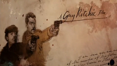
A screen capture from the Sherlock Holmes film end credits.
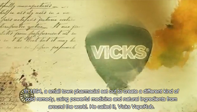
A screen capture from the Vicks commercial.

Posted in Blog | Comments Off on It’s elementary flattery.

Writing for Change

What do Gap, Netflix, Verizon, Congress and Komen all have in common? The written word changed the way they do business.

In 2010, Gap launched a new logo design. It was slammed in social media circles for being worse than the original, and Gap dropped it. Last year Netflix and Verizon wanted to change they way they charge customers. Customers revolted and the charges were dropped. Last month, Congress was trying to pass the SOPA legislation, and after what amounted to a 24-hour internet sit-in and letter-writing extravaganza, the bill was withdrawn.

Last week Susan G. Komen for the cure made a decision based on politics instead of women’s health, pulling funding from Planned Parenthood, and enraging women everywhere. So big, so loud, so immediate was the noise and the hit (negative PR to Komen, positively to Planned Parenthood who raised over $650,000 in 48 hours), even Komen executive Karen Handel heard it in the end.

What I loved most about watching all these scenarios wasn’t seeing big organizations and muckety mucks cower under the power of the little people (okay,  I did enjoy that a smidge). What I loved most was it showed how much influence the written word still has, and the potential for positive change it could have. All the above instances show how we made a difference reactively. Now, pick any topic, cause or need, and imagine what we could do if we collectively used our words proactively instead.

What will you write for change?

This post is dedicated to a dear friend, Sharon Rapoport–a Komen volunteer, a Planned Parenthood supporter, copywriter, and a breast cancer survivor. Last week's issue made her sad, angry, conflicted, and overwhelmed with messages from friends and family. It also gave me one more reason to say, Sharon, you inspire me. You handled last week flawlessly, communicating with everyone as only a copywriter can. You wrote honestly. (Photo from July 2010 issue of Valley Business FRONT.)

First Fridays: io studio

My First Fridays feature is not about a typical artist. She’s not a designer,  yet she creates. She’s not an author,  yet she writes. What she produces, people generally never see, but without it the art wouldn’t be functional. She is Christina Reeser, web developer extraordinaire and owner of io studio.

When Christina speaks about programming and development she sounds like an artist. She’s modest, curious and insightful. She explains widgets, CMS, style sheets and scripting with the enthusiasm of a painter describing the sunset. If she has to modify a dimension, move an element or create a chart it always makes the website look and perform better.

She once told me that programmers are like chefs who “each cook a little differently in their own kitchen.” But when I’ve worked with other developers (some of whom Christina has gladly helped out) and they see her code, they often say, “Wow. I want to swipe this!”

Over 350 websites contain her “DNA,” as she calls it. As a designer craving sites that look like print, Christina is the perfect programmer to help prepare my pages. For just as her tagline says, Christina is where functionality meets form. {Beautifully}

When you visit Christina’s io studio website, I urge you to disregard the design. Instead, go under your browser’s pull-down menu “tools” and look for the site source. There, you’ll find <title>Io Studio, Inc</title> and a full site built in just 29 lines of {beautiful} jquery.

Artists see the world differently. So does Christina. I think it takes a special kind of mind to work in a world like this every day.
The code isn't the only lovely thing about Christina.

First Fridays: The Snowflake Man

For 2012, I made a wish and some resolutions. I wished for a little snow, and I resolved to focus on fewer things and  learn more about my camera and photography. All of those were made because I heard about my First Fridays artist of the month, Wilson Bentley.

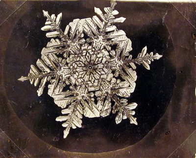
A self-educated farmer in Vermont, Bentley was the first person to photograph a single snowflake in 1885 . His obsession with the world of photomicrography and the tiny crystals led him to snap pictures of more than 5000 individual flakes. As you might have guessed, no two were alike. We learned that from Bentley’s work, and so Bentley became known as The Snowflake Man.

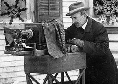
At the time that he began his work, he didn’t have all the fancy equipment even little ol’ me has. He rigged up a microscope to a bellows camera, stood out in the cold for hours at a time, sifted through falling flakes and one-by-one captured what fell around him. Bentley said, “It seemed a shame that this beauty should not be seen and appreciated by others.”

That’s the point of photography, isn’t it? Not just to document the world, but to capture it as you see it so your vision can be shared. Photography expands our world, because like the snowflake, no two viewpoints are alike. What do you hope to see, do or share this year?

You can read more about Wilson Bentley on the museum website  or order a book of his photos while you wish for a few winter flakes.

This undated photo provided by the Carl Hammer Gallery shows one of the snowflakes recorded by Wilson A. Bentley. (AP Photo/Carl Hammer Gallery, Wilson A. Bentley)


Wilson Bentley and his bellows camera. Courtesy of Snowflake Bentley Museum.


Posted in Blog | Comments Off on First Fridays: The Snowflake Man

First Fridays: Heirloom Originals

It’s First Friday again. (How on earth is it December already?) As the holidays approach, and gift-giving time draws near, I’m featuring artist and friend Jennifer Hays. Jen and I worked together years ago in a small ad agency. She’s now a Senior Art Director in New York, but on the side, she, like most designers, pursues another art form. For her, it’s hand-made jewelry under the label Heirloom Originals.

Jen’s pieces are like nothing I’ve seen before. They are a mix of old antique chain, chandelier pieces, vintage scarves, rare findings, and salvaged leather. She hunts down the individual elements, takes them apart, twists, gathers and clips them together to create brand new creations with antiqued yet sturdy chains, clasps and hooks. Each necklace or bracelet is unique–no two are alike because parts are simply found–sometimes in bundles, but sometimes alone and neglected and waiting for her to come along to scoop them up. The collection is constantly updated with newly discovered textures, colors and materials.

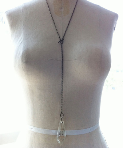
With Jen’s creative eye, each finished piece is art directed and lovingly photographed by her as well. Close-ups show knots and details. Glass lies on wood to show structure. Necklaces strung on a vintage mannequin give a sense of length and wearability–showing Jen’s practical side.

If it’s a one-of-a-kind gift your looking for, made by the delicate hands of thoughtful American designer, using repurposed materials, look no further than Jen Hays. Her pieces are limited, so shop early.
Her Heirloom Originals are on Etsy and on Facebook.
(If you’re curious, you can also check out Jen’s day job creative projects at WorkAndThings.)

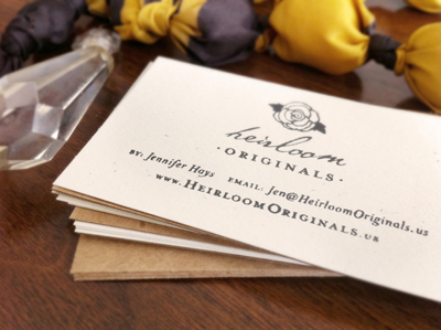
Close up of a reset crystal, chandelier pieces and edgy chain.


The Lariat necklace featured on Etsy.

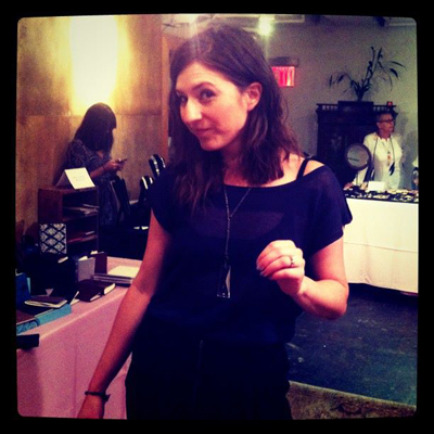
Jennifer Hays wearing her own creation at a jewelry show in New York.


The Ultimate Jobs Creator

Many cities around the country hold First Friday events when artists showcase their work. For Compositions, I’ll be featuring an artist for the first blog of each month, and this month it simply has to be in honor of Steve Jobs. My life would not be what it is today without the inventions and vision of Steve Jobs. It was an Apple II my artistic fingers first found. My first business expense was a $2500 Apple G3 desktop. Six years later I humbly traded it with a friend for a new i-pod Nano. With my MacBook Pro I’ve traveled to Paris, Canada, across the US, built my business and my portfolio, and written a book or two.

Perhaps my greatest influence from Steve and Apple was in creativity. There are many rules when it comes to composition–for writers, for photographers, for designers and artists–and he was known for bending, snapping and blowing them all. By forging new boundaries with his work, he enabled me to try new things with mine. The commercials, the packaging, the colors, and technology all showed me I could build things that are both smart and beautiful. More importantly, when I strive to create something worthwhile, I have seen how it helps others discover their own worth.

He didn’t just talk about creating something different. He didn’t just talk about building jobs. He didn’t just talk about making the world better. He actually did it. Just as he said he would in this 1997 commercial. Thankfully.

Now it’s up to us. How will you pay it forward?

© 2024 Karen A. Chase. Collection of data from this website is GDPR compliant, and any information you may have about data collection can be found in our privacy policy.