first fridays

Bonjour 40 Korbella Giveaway

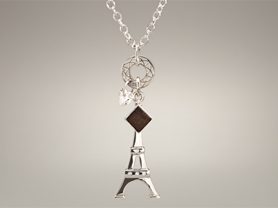
Imagine it. You could wear an actual piece of the Eiffel Tower! Korbella is my First Friday artist–a darling company that has lovingly crafted pieces of old Eiffel Tower stairway into gorgeous silver and vermeil charms.

BONJOUR 40 KORBELLA GIVEAWAY
Beginning today and running through February 8th, next Friday, Korbella is helping me give away a necklace to one lucky reader. Korbella’s Charmes de Paris necklace has a retail value of $525. This sterling silver necklace is hand-finished, with a heart-shaped Swarovski CZ drop, a charm in the shape of Paris’ famous landmark, and an actual piece from the original Eiffel Tower! And you can wear it while reading a free, signed copy of Bonjour 40.

Pendant_400_2

How Korbella Created The Pieces
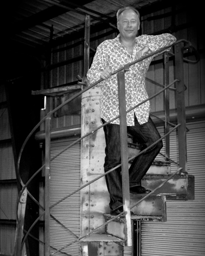
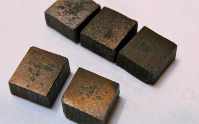
The line of stunning jewelry came into being after its founder, Paul Michael Bedell, and his wife, Janel, and their nine-year-old daughter, Samantha, traveled to Paris in 2011 and were inspired. Soon after, Paul acquired a section of the original spiral staircase that had been removed back in the 1980s, when it was cut into twenty-four elements, auctioned off, and scattered across the globe. Then, they went on to design the collection. (See below for pictures of Paul on the stairs, and the Eiffel Tower pieces.)

As the company says, Korbella’s Eiffel Tower Forever collection “draws inspiration from the strong architectural cues of the Tower… a nod to the Tower’s Art Nouveau roots—and its world-renowned latticework.” And part of the design is a rustic artifact from the spiral staircase.

I’m thrilled to bring you a chance to wear your own little piece of Paris, with love to all my readers. Enter to win here and have a sweet and charming Valentine’s Day!

a Rafflecopter giveaway

Paul_OnStairs

EiffelPieces


This promotion is in no way sponsored, endorsed or administered by, or associated with, Facebook. We hereby release Facebook of any liability. Winner(s) will be contacted by email 72 hours after the giveaway ends. If you have any additional questions – feel free to send us an email!

First Friday: Caaalvin

Resolutions

It’s a First Friday. The first Friday of the month when I’m supposed to feature an artist. But as I’m writing this it’s 8:45 on Thursday night, and I’m already behind with no clue about what to do for my first post of the year. Did I procrastinate? Uhm… Maybe I put it off a little. “But I was having such a nice holiday,” she whined.

The first half was a whirlwind Manhattan day, then mostly Italian dinners and sitting in traffic, but the last half was sitting with friends, in movie theaters, over coffee, and having a lovely time taking a break.

So alas, I’m sitting here at the beginning of 2013 resolving to accomplish great things while I am falling behind (and yet hopefully giving off the appearance of being completely organized). I’m only four days in. Geesh. Good grief. Deep breath. Sigh…

Actually that’s my best resolution idea yet. Let’s all take a deep breath. No lofty unattainable goals. No distressing resolutions. Maybe just a deep breath and the willingness to give everyone, including myself, a break. A chance to begin anew (that includes you, too, Congress). A little change will do us all a little good, and that starts by taking a deep breath. Yes, Calvin, even you.

So here’s to you Bill Watterson, the creator of my favorite comic strip. My year begins with a big thank you to you as Calvin and Hobbes remind me to stretch, give a good tummy rub and breathe.

Calvin_and_Hobbes_by_xX_Pureness_Xx


First Friday: Sandy Fakes

At the beginning of this week, the world watched and waited for glimpses of what was happening as horrible Hurricane Sandy swept into New York. We had plenty of warning, and consequently, many designers with Photoshop had plenty of time on their hands. In light of what happened, they are silly now, but I wonder if perhaps some of these images didn’t help those of us who could do nothing but wait.

Did the fake photos allow you to feel compassion for what was happening by providing visuals that made you then search out real ones? Did some of them give you a silly moment in the face of worrying and concern. For me, yes, to both.

I give you a gallery of the Photoshop fakes. The best of which I believe is Chris Henson’s. A designer and copywriter in Virginia, he reworked an image he had posted earlier in the day–a trampoline stuck on wires. I think it’s the best because it was obviously far from reality, but it gave his friends a break we needed. Then we all went back to waiting.

After having now seen all the real images, they are in fact more dramatic than the fakes. We’re stunned. I hope you’ll be spurred into action. Our fellow humans need us. And so do many pets. 

If you took the time to read this post or look at the pictures, I hope you’ll spend five minutes more to send help.  NBC has posted this ‘How To Help After Sandy’ list.


First Friday: Greg Osterhaus

“Barn Over Gold” ~ A 36″ x 48″ original Greg Osterhaus oil painting.

I met Greg Osterhaus when he was a graphic designer, painting part-time in his basement next to the washer and dryer, while he and his wife raised three kids. That was thirteen years ago. Since then some things have changed.

He paints full-time now, and his work is in both corporate and private collections. He paints gorgeous, oil-based landscapes with brush strokes that capture the scenery, the grasses and even the wind so they feel like they’re moving on the canvas. He has found a niche painting incredibly soulful portraits of cows that make viewers long to own his pieces (and consider cattle as pets).

Many artists wait for the muse goddess to strike, but Greg is the first artist I’ve met who strictly schedules two to four solo exhibitions per year. Yet what seems to inspire him most is simply his own curiosity.

“For me, painting is about much more than the obvious subject matter. It is also an essay in color, in composition, a comparison of light versus dark, grays versus hues, soft and hard, yin and yang, this and that. So there’s always another corner to turn. It is my hope that this something extra will be enough to keep the eye and mind engaged for years to come.”

The result? Canvases that he hopes will keep the eye engaged, no matter how often they’re viewed, and regardless of the fact they still come from his studio in the basement next to the wash, fluff and fold.

To view more of his works, visit Osterhaus Art.

Greg in his basement space with a larger-than-life cow portrait.
Some artists need pot to keep them inspired. Greg took up pottery. For nine years he’s taken classes and grown in his ability to throw at the wheel.

Posted in Blog | Comments Off on First Friday: Greg Osterhaus

First Friday: Niki Sebastino, Design Geek{ess}

Niki Sebastino, the ultimate design geek{ess}, and her assistant, “Merri.”

I first met Niki over ten years ago while we were both at a small agency in Southwest Virginia. A designer and production artist, I recall her being two things: funny and curious. Ten years later, she’s not just a designer, but has also taught herself to become a programmer, and so she has shown me a fine example of someone who built a new life for herself.

She is about to begin a new job with a major corporation in their IT development department, and she has her own freelance web programming company, Design Geek{ess}. Although she developed herself in new ways, some things haven’t changed.

We have worked together on several projects, and those two traits I originally saw in Niki are better than ever. Her curiosity drove her to learn new skills, and it has allowed her to reach out for more information–either to online chat groups, other programmers, clients, or online resources–when the work requires it.

Her sense of humor, evident in any conversation, makes her really accessible and small hiccups in projects easily overcome. She is the first to admit she’s a total geek, and she plays with jquery, analytics, new plug-ins and widgets like a kid with a new puppy.

As the lead programmer on my new project, 224Pages, Niki quite frankly steals the show. The design might be mine, but it’s the magic of her programming that allows the site to read like a book.

Below is an image of Niki’s own site, self-programmed of course. Her “What?” section contains a portfolio of her great websites.

First Friday: London Olympic Art

Graffiti artists abound in London. Here, an image taken on the South bank of the Thames in an area where graffiti is allowed, was done for the wedding of Prince William and Kate.

London likes to dress up for special occasions. In honor of the 2012 Summer Olympics, my First Friday is dedicated to some of the artistic endeavors inspired by the games. (I will not give praise to the disastrous 2012 logo and mascots only McDonald’s could love.)

Dress
Could the styles of uniforms for the athletes be any more vogue? Stella McCartney designed the stunning UK team’s Adidas gear, making me wish I biked for Britain. (Meanwhile, Ralph Lauren designed the clothes for the USA team… but they were made in China. Doh!)

Hat
Londoners love hats, so the Mayor dressed up a few of the city’s iconic statues with designer creations that play homage to the flag and even to SPAM (Spam, Eggs, Spam and Spam).

Olympic Park Art
Aside from the stadium which transformed the historically grubby east end of London, the Olympic Park is home to one-of-a-kind art installations commissioned for the park, including a giant mirrored display of the word RUN. See more in the official Art in the Park brochure.

Graffiti
London is among the best in the world for beautiful street art, and its graffiti artists have stepped it up for the Olympics, like this perfect placement high-jumper by Banksey. Sadly, the International Olympic Committee and the British Transport Police (BTP) have been fiercely removing graffiti they feel doesn’t fit the Olympic brand or is too close to the venues. Banskey’s work is fighting to stay.

See more in this photo gallery of Olympic inspired art installations in London.

Posted in Blog | Comments Off on First Friday: London Olympic Art

First Friday: Matt Flowers’ Landscapes

A Matt Flowers Landscape

Imagine a mountain top. Way up high. With old craggy rocks springing forth with glorious evergreens reaching for the sun. The above artwork is part of a collection by Richmond artist, Matt Flowers. But all is not as it appears. It is not a photo of place. It’s a place created by Matt that and your interaction with it makes you feel huge while at the same shrinking you in an Alice in Wonderland kind of way.

Using driftwood, rocks, moss, enamel, paint and detailed hand work that is surely going to give him early-onset crows-feet, Matt is a sculptor of landscapes that are driven by his photographic eye. In taking pictures of Matt’s work for this post, I quickly realized I was not capturing one of the most essential and remarkable elements of his sculptures. Scale. So I included a frame of reference to help you comprehend the size through a series of images.

Using the found elements and adding in tools like magnifying glasses and backlit screens, Matt engages the viewer to discover life-like imaginary worlds. Some of his pieces use antique lenses tucked into handcrafted boxes mounted on vintage tripods to create small dioramas that make the viewer feel as if they’ve dropped into an H.G. Wells-like world where nothing is as it appears. His tiny details create landscapes that upon closer inspection feel larger, giving the viewer a magical glimpse into another place both of this world and of Matt’s imagination.

This gallery of images of his sculptures better explains the work, and for more information visit Matt Flowers’ website.

Posted in Blog | Comments Off on First Friday: Matt Flowers’ Landscapes

First Friday: Gregory C. Randall


This month’s featured artist is an urban designer, graphic designer, illustrator and  prolific writer. Gregory C. Randall shared some insights about his writing and his latest book, Elk River which was just selected by the Independent Book Publishers Association and its Benjamin Franklin Awards as one of the three best books in the LGBT category.

How much do you write, and what’s your process?
I try to work two hours a day, up at 5:30, 12 cup coffee maker bubbling, fingers poised. A thousand words is my goal, but when I’m hot I can get 1500. My blogs help sharpen my pen and my style, they go about 1800 words every week. That’s about 7000 words a week, and I have published five of my own books so far. I have been a practicing landscape architect and urban designer for forty years, and designed hundreds of communities and projects from housing to high tech. Each is a process with a beginning, middle and conclusion. It’s easy to look at writing as the same process.

What is it about each story that compels you to write it?
I’m not a stylistic writer like Pat Conroy or others, but the idea of crafting a story that engages a reader intrigues me and to be honest, is a lot of fun. If I can entertain that’s my goal.

What do you hope readers take away from Elk River?
A sense of timelessness. Howie’s story is not unique, families are faced with huge troubles and for the young it can come at them hard. Also a sense of wonder. City kids miss a lot of the softness and hardness of nature. It’s also the times (1950s) and the migrants, the medical care, the lack of anti-depressants, the issue of culture and smoking, and of course homosexuality. Some are verboten now, others were then, but times do change and the reader begins to understand the complexities of even simple societies. I hope.

Trying to do Gregory’s work justice in 250 words is darn near impossible (and I failed). So you’ll have to flip over to one of his many sites, blogs or buy Elk River and find out just how prolific and talented he is.

Greg C. Randall Website
Writing4Death Blog
Elk River Blog


Gregory also created the illustrations, like this one of a muskrat, for the book Elk River. Of course he did!

First Fridays: Bonjour “Paris in Color”

This month’s First Friday artist sticks with the Bonjour Paris theme: Nichole Robertson is another writer, photographer and Parisian-lover. She has a delightful book out called Paris in Color. Yes, Paris is definitely photograph-able. But Nichole takes it to a lovely work of art level by gathering her images together by color.

Before she moved to Paris for a year, she began a site called Little Brown Pen. The name and the site are adorable and it links you to the book, a bit of info about Nichole and the photography collection she dubbed “The Paris Color Project.” After moving to Paris, she would head out with her camera, and when a colorful item grabbed her attention, she’d take photos of that color for the day. As she says in the book, “Nothing sharpens your senses like a new address.”

Upon returning home each night, she’d post the colorful images. Now those images can be found in her book. They can also be found in The Paris Print Shop. It’s a site Nichole and her husband set up to sell the images, postcards and more. And her work has gone on to be featured by Martha Stewart, Real Simple, and The New York Times among others.

Are you green with envy for that little Vespa you saw near the market? Now you can own a collection dedicated to the color. Are your skies gray because you miss Paris terribly. Or perhaps yellow is how you are feeling today. This yellow image is downloadable for your desktop wallpaper from her publisher’s facebook page at Chronicle Books.

First Fridays: io studio

My First Fridays feature is not about a typical artist. She’s not a designer,  yet she creates. She’s not an author,  yet she writes. What she produces, people generally never see, but without it the art wouldn’t be functional. She is Christina Reeser, web developer extraordinaire and owner of io studio.

When Christina speaks about programming and development she sounds like an artist. She’s modest, curious and insightful. She explains widgets, CMS, style sheets and scripting with the enthusiasm of a painter describing the sunset. If she has to modify a dimension, move an element or create a chart it always makes the website look and perform better.

She once told me that programmers are like chefs who “each cook a little differently in their own kitchen.” But when I’ve worked with other developers (some of whom Christina has gladly helped out) and they see her code, they often say, “Wow. I want to swipe this!”

Over 350 websites contain her “DNA,” as she calls it. As a designer craving sites that look like print, Christina is the perfect programmer to help prepare my pages. For just as her tagline says, Christina is where functionality meets form. {Beautifully}

When you visit Christina’s io studio website, I urge you to disregard the design. Instead, go under your browser’s pull-down menu “tools” and look for the site source. There, you’ll find <title>Io Studio, Inc</title> and a full site built in just 29 lines of {beautiful} jquery.

Artists see the world differently. So does Christina. I think it takes a special kind of mind to work in a world like this every day.
The code isn't the only lovely thing about Christina.

© 2024 Karen A. Chase. Collection of data from this website is GDPR compliant, and any information you may have about data collection can be found in our privacy policy.