promotion

Constructing the Eiffel Tower

In honor of the last day of my Eiffel Tower necklace give away, I pay homage to this fabulous landmark,  originally constructed for the 1889 Exposition in Paris. Despite the fact that all of its metal could be melted down to fit a 125-meter-square base less than 2.5 inches high, it took two years to build.

I’m especially thrilled that someone had the smarts, and we had the technology, to photograph the construction process. All these images come from Wikimedia Commons and are in the Public Domain. Click on an image to enlarge and scroll through the gallery. Enjoy!

A few more Eiffel facts:

~ Thomas Edison visited it in 1889.
~ Radio transmitters were fitted in WWI to jam German communications.
~ There used to be a pâtisserie on the second level.
~ Gustave Eiffel entertained in an apartment on the third level.
~ 72 names are engraved on the tower–all French notable people.
~ It’s painted every seven years with up to 60 tonnes of paint.
~ When it opened, the lifts weren’t operable.
~ It took visitors and hour by stairs to ascend the tower.
~ The original spiral stairs were removed in the 1980s.

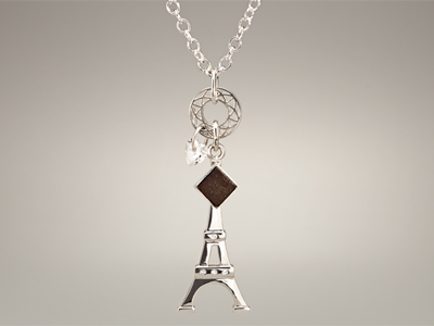
Korbella is helping me give away an Eiffel Tower necklace made from that spiral staircase to one lucky reader. Korbella’s Charmes de Paris necklace has a retail value of $525. This sterling silver necklace is hand-finished, with a heart-shaped Swarovski CZ drop, a charm in the shape of Paris’ famous landmark. Enter before midnight tonight, February 8th.

a Rafflecopter giveaway

Bonjour 40 Korbella Giveaway

Imagine it. You could wear an actual piece of the Eiffel Tower! Korbella is my First Friday artist–a darling company that has lovingly crafted pieces of old Eiffel Tower stairway into gorgeous silver and vermeil charms.

BONJOUR 40 KORBELLA GIVEAWAY
Beginning today and running through February 8th, next Friday, Korbella is helping me give away a necklace to one lucky reader. Korbella’s Charmes de Paris necklace has a retail value of $525. This sterling silver necklace is hand-finished, with a heart-shaped Swarovski CZ drop, a charm in the shape of Paris’ famous landmark, and an actual piece from the original Eiffel Tower! And you can wear it while reading a free, signed copy of Bonjour 40.

Pendant_400_2

How Korbella Created The Pieces
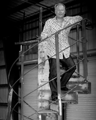
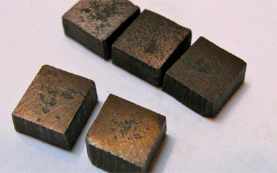
The line of stunning jewelry came into being after its founder, Paul Michael Bedell, and his wife, Janel, and their nine-year-old daughter, Samantha, traveled to Paris in 2011 and were inspired. Soon after, Paul acquired a section of the original spiral staircase that had been removed back in the 1980s, when it was cut into twenty-four elements, auctioned off, and scattered across the globe. Then, they went on to design the collection. (See below for pictures of Paul on the stairs, and the Eiffel Tower pieces.)

As the company says, Korbella’s Eiffel Tower Forever collection “draws inspiration from the strong architectural cues of the Tower… a nod to the Tower’s Art Nouveau roots—and its world-renowned latticework.” And part of the design is a rustic artifact from the spiral staircase.

I’m thrilled to bring you a chance to wear your own little piece of Paris, with love to all my readers. Enter to win here and have a sweet and charming Valentine’s Day!

a Rafflecopter giveaway

Paul_OnStairs

EiffelPieces


This promotion is in no way sponsored, endorsed or administered by, or associated with, Facebook. We hereby release Facebook of any liability. Winner(s) will be contacted by email 72 hours after the giveaway ends. If you have any additional questions – feel free to send us an email!

Bonjour 40 – Le livre est arrivé!

Bonjour 40: A Paris Travel Log, the print version, is now available on Amazon!! Oh la la!

So many readers asked for it and it’s finally here. After the success of the eBook and receiving an eLit award, I went out to find an agent and a traditional publisher. But then I got to wondering what kind of book they would make. What would it look like? What would the design feel like compared to my trip? I’m a professional designer, and we like things just so. After some searching and a lot of encouragement, I eventually gave in… no, stepped up, and said, “Karen, you can do this.”

So I combed through the thousands of photos from the trip, and added in some new text. Then I went at it. Now it is 132 full-color pages, 8.5×8.5, with over 100 images. It feels more like a photo journal and a pictorial journey through Paris, but it still has my stories about a strange pillow and Bandit the dog.

If you loved the eBook, I hope the print version will be on your gift list–for yourself and others. Joyeux Noël.

For those who want to know how I produced the book, my process included:

~ InDesign for the page layout of the interior and cover.
~ Photoshop to crop, resize and color correct all 109 images.
~ Worked with April Michelle Davis to edit the copy in the new layout.
~ Opened an account through Createspace (Amazon’s print self-publishing).
~ Submitted a PDF of my files and they sent me a physical proof.
~ Based on the size and page numbers, Createspace helped me set pricing.
~ Approve it all, and wait 5-7 days for it to hit Amazon.

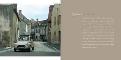
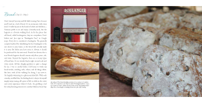
A few of the inside pages are below. To see more, you can “Look inside” on Amazon.

What’s not in a trailer?

By trailer I mean book trailer not a double-wide (What’s not in a double-wide is me in Daisy Dukes drinking a beer.) What authors and publishers are doing with mini movie-like previews of books ranges wildly. Here we’ll review what not to include.

Too many words
Darling, now is not the time to wax on. You have one or two minutes to impress, so the writing on the screen or the voice-over better be succinct. (Please, no authors at home using hand-held cameras saying “I wrote this because…”.) Sum up and sell the story.

Spoilers
As a friend of mine used to say while playing Kanasta, “Chest your cards, girls, chest your cards.” Pitch just enough so readers will want to buy the book. Why buy the cow…

Stolen Stuff
I love Yo-Yo Ma but I can’t use his music. Make sure you have the rights to images, music, videos and even fonts by purchasing them for a small fee from reputable stock websites and sources. The music on Bonjour 40 cost $39 and is it mine to use? Yo-Yo betcha.

BlahBlah
It’s tempting to list where to buy the book, reviews, available formats, etc. This is not a used car ad. Most likely the trailer will reside on your website, on Amazon, or in digital press kits with other details, so add a quote or two, but keep the blahblah to a minimum.

Credits
You aren’t Ron Howard. Think of these as commercials, and unless you’re selling book trailers or giving credit to live actors, focus on the book.

A great sampling of trailers can be found on BookRiot. Stay tuned for more trailer information soon…

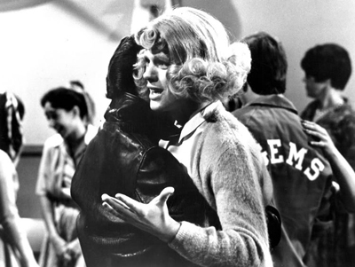
Public Domain images like this one of Ron Howard and Henry Winkler dancing on “Happy Days” can be a great source, too. This work is in the public domain in that it was published in the United States between 1923 and 1977 and without a copyright notice. Wikimedia Commons is the source.

Posted in Blog | Comments Off on What’s not in a trailer?

Author Websites

If you’re a new author or a self-published author, you need one. Even JK Rowling and Wilbur Smith have them. But what makes for a good author site?

Above all, the site must provide details about your book(s) and also contain links to retailers for purchasing. However, it’s also to help readers connect with you. The website URL should be YourAuthorName.com and not YourBookTitle.com (unless of course you plan on being a one-hit wonder). Assuming you’re not, the website is your library and forum, so set it up as such.

Websites for authors don’t have to, and probably shouldn’t be, large. You want to write books, not update websites. Navigation tabs at minimum should include:
About – Books – Contact

The optional stuff is where your readers get to interact with you, and that’s crucial in gaining a following. So additional navigation can include things like:
Book Trailers/Video – Press/News – Blog – Photo Gallery – Twitter Feed

Contact info is tricky. Many authors work from home, so listing a phone number and address can feel creepy, especially for the gals. So provide a contact form for readers. Links under your “contact” navigation can include all the social media accounts you have, so readers can connect with you there as well:
E-mail – Facebook – Twitter – Goodreads – RSS Feeds, etc

What other content do you think author sites should have?
Please share examples of author websites with great features or functionality.

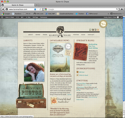
When building my author site, I designed it so the Eiffel Tower background behind the middle section can change as new books are released, giving the site a fresh feel and PR functionality, while content stays the same.

Posted in Blog | Comments Off on Author Websites

A book trailer for Girl Unmoored

Debut author, Jennifer Gooch Hummer, recently worked with me to build a new book trailer for her YA novel, Girl Unmoored. Her novel has been garnering all kinds of awards (see the list below), and so Jennifer was ready to produce a mini-movie about the book. The trailer needed to give an overview of the story, match her book cover and author website, and also showcase a couple reviews and awards.

To find out more about her story, watch the Girl Unmoored book trailer

To build the trailer, first I read the book! Her main character, Apron, has a funny yet very moving way of viewing the world, so we knew the text had to not only match the book marketing, but Apron’s tone of voice. Working with the artwork and fonts from the book cover, I also added a couple videos and music to help it feel like 1985, the time period of the story.

So today Jennifer launches her new book trailer and announces her collection of fabulous awards. Congratulations!

Jennifer’s awards include:
Cross Genre, National Indie Excellence Book Awards
Best YA Fiction, Paris Book Festival
Best Teenage Fiction, San Francisco Book Festival
YA Fiction, and finalist for Best Cover Design and Chick Lit
Next Generation Indie Book Awards
Finalist for YA Fiction and Best New Fiction, International Book Awards

“Love, loss, and the coming of age of one remarkable girl blaze through this haunting debut like a shooting star you’d wish upon. It’s tough and tender, funny and smart, and it frankly took my breath away. I loved it.”
– Caroline Leavitt, New York Times bestselling author, Pictures of You

“…infused with love and punctuated with wry good humor… Apron may be adrift, but Hummer’s debut is on track.”
– Publishers Weekly


Posted in Press | Comments Off on A book trailer for Girl Unmoored

Book Review: Book End Babes Confessions

I received an oh-so-lovely review of Bonjour 40 from a fun blog called Book End Babes. In “Confessions of a Closet Francophile,” Heather Dearly admits her unending desire for Paris, and chats about her armchair review of my 40th birthday adventures in the city.

Back in October, her fellow-blogger on BEB, Melena Lott, was kind enough to do a review and include an excerpt. They’ve done a new review and update because of the new eLit awards the book has captured, and well, because they love books and all things France.

So needless to say, Heather and Melena – merci beaucoup! I’m so glad you not only read Bonjour 40, but enjoyed a little stroll through the Paris streets right from your own living rooms!

Posted in Press | Comments Off on Book Review: Book End Babes Confessions

Expanding a Brand

Last week on Compositions, I featured my new Church Hill Association (CHA) and neighborhood brand and website. Today, let’s chat about expanding a brand.

On April 22nd, my neighborhood is hosting a lovely springtime event called the Secret Garden Symphony Tour–visitors can tour private gardens and listen to Richmond Symphony ensembles all over The Hill.  I’ve been helping with the design of materials to support the event. Having just completed the neighborhood brand, I went back to the new CHA brand standards. We have fonts. We have colors. We try to include color photography when possible. So when it came to building the Secret Garden materials, I had only to build an event-specific logo, and then simply apply the graphic standards.

I viewed the  standards not as restrictive, but as a springboard to give me a starting point for the creative for this event. As a result, my probono job was simplified because I wasn’t having to make basic font, color or layout decisions all over again. For Church Hill, the Secret Garden materials look consistent with the CHA website and other collateral, enabling viewers to more easily recognize who we are. They’ll see our brand expanded on our website and now through the collateral for this event collateral: in publications, on banner ads, posters, flyers, tickets, and of course on the CHA site where you can purchase tickets.

As a designer, how do you view brand standards? As a help or a hindrance?

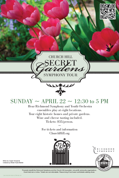
The poster for the event using a percentage of the CHA green, the font Bodoni book, and the CHA logo.

Posted in Blog | Comments Off on Expanding a Brand

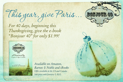
Promotion: Give Paris for just $1.99

For 40 days, between Thanksgiving and January 2nd, Bonour 40 is now just $1.99 (on sale from $4.99). So this year, you can give everyone Paris! For book trailers, information and where to buy, go to books.

Posted in Press | Comments Off on Promotion: Give Paris for just $1.99

© 2024 Karen A. Chase. Collection of data from this website is GDPR compliant, and any information you may have about data collection can be found in our privacy policy.