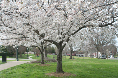
Although Spring has come early this year, I can’t say I’m disappointed. I tire easily of the somber gray and black that seems to saturate my wardrobe and the skies during winter. So bring on spring and all it’s wonderful bloomin’ color.
For designers, spring means that Pantone®, the world-renowned authority on color, is releasing it’s spring color suggestions. While the colors are focused on fashion, they’re also a marvelous tool to help guide graphic designers, product developers and even consumers in their choices. Rather than simply setting a trend, the color guide is more of a reflection of the mood or psychology of society. We’ve been “occupied” under drab tents all winter in a recessed economy, and what the masses are primed and ready for is optimism. So hello “Solar Power” yellow. Spring in “Tangerine Tango” orange. And when all else fails, drown yourself in “Margarita” green. Here is the Pantone Fashion Spring Color Report.
If that’s not enough fun for designers out there, how about this new online tool from Sherwin-Williams. My friend Jennifer (a First Friday artist previously featured on my blog) sent me this link for “Chip It!” Let’s say you find a photo online that you love? Chip It! and the little program will pull a color palette from from their 1500 paint chips. That’s a handy little tool for picking room paints, but I can think of a multitude of reasons to use it to pick colors for client projects, too.

2 Comments on The Color of Spring
Comments are closed.


Spring has definitely sprung… I too have noodled with that Sherwin-Williams app, downloading it to my iphone a few months back. I was being quite indecisive about which color I wanted to be greeted by as I came home each day and the kind of general mood reflected overall in the room. (I mean, we will be drinking wine and watching movies together on Saturday nights…)
The bug must of finally bitten because this past weekend I painted an accent wall over my mantel Swizzle stick.. or rather a bright peacock blue.. I am officially in love!
Just when I thought I had enough design addictions, here comes this beautiful app. Great post! If anyone needs me, I’ll be at my mac picking color palettes for the rest of the day…