The Art of the Tarot

That’s me on the left receiving my reading from Jan Thomas. She jokingly laughed at the idea of putting a “Tarot Reader In” sign in her living room window. Strange how that lighting turned out in this photo. – Photo by Karen Rankin

BOO! In honor of Halloween, a very tiny glimpse into Tarot cards. I was recently at a book club, and a few of us unexpectedly received a reading by the host, Jan Thomas. My first ever. She asked me to provide a specific topic or concern, and she dealt the cards and told the tale she saw. Two things have haunted me most.

First, the artistry. Tarot cards date back to the fifteenth century, and many decks are stunning. Imagery is often filled with old world or art nouveau styling, and for illustrators of sci-fi or fantasy, I imagine they’ll be charmed. (That’s not to say there aren’t modern versions, like these featuring the Simpsons.) Jan’s cards are a Rider Waite Smith deck. “First published in 1908… there are several editions and I was using the one call Universal (has to do with the re-coloring of the deck).”

Secondly, a couple of the cards she pulled were a relief. One was The Knight of Pentacles (see image below). This card has layered meanings, but she described it as a knight who is serious, on solid ground, and holding a coin, so the dreams he looks out over, although a bit away, will be a fruitful reality. The last card she revealed, on the bottom of the deck, was death. That’s good news because it’s the furthest away from my dream, and me personally. Whew!

So will my reading turn out to be a trick, or a treat? I guess I shall have to “stay tuned” to find out. Muwahahaha.

Click here to download Jan’s reading of my cards corresponding to the picture below.

A shot of the cards that were pulled for me with the two cards I mentioned circled. Go ahead, Tarot readers, tell me what else yee kin see in ’em….. – Photo by Kelly Fitzgerald

Posted in Blog | Comments Off on The Art of the Tarot

Travel to the new ShelfPleasure.com

Kristen Weber, who was my editor on Bonjour 40, has just launched a new website! With co-founder Stacy Gerard, they’ve created a website for women who love to read–a destination spot to chat about all things bookish. As they say on their new site, “Shelf Pleasure is a go-to source for the latest book news and trends.”

In their first week, I’ve been fortunate enough to be among the contributors for a fun section called “love/hate,” in an article called Will Travel For Words.

So grab a book, a steaming cup of coffee, and come on over to Shelf Pleasure. Soak yourself in books until your fingers get all pruny.

Guest Post: Composing Confidence

Many designers and artists have a problem selling themselves well. With her new book, BizEtiquette, Cassie Piasecki’s tips are a must-read. Today, she is my guest-blogger, writing about the importance of confidence. Cassie…

I have a friend who bakes cookies for a local café. They are amazing and on most days, they sell out before lunch ends. Once or twice a month she delivers a couple to my office with a note that says, “These aren’t that good but I hate to throw them away.” A few weeks ago, I took an exercise class from a friend of a friend that had stellar reviews.  As I held out my hand to shake hers, she leaned in and said, “My classes are probably way below your fitness level. You should check out Gym XYZ.”  Both of these ladies broke a basic BizEtiquette Rule! It surprises me how frequently I find someone just starting out in business with the same attitude.

Have you turned off a new client before they even got a chance to know you?
“My store is a mess.”
“My newsletter was boring.”
“This necklace isn’t that cute.”

To have great BizEtiquette, you must be confident! Being confident allows you to look people in the eye when you meet them, ask to be paid what you deserve for your services and create demand for your products. No excuses. If you don’t feel great about the stuff you are putting out, fix it. The stuff you do put out? Own it! It is the best widget out there. If you do this, you will never feel the need to discount yourself, your service or your product to a customer.

Cassie Piasecki is the author of BizEtiquette.  She is a Pro-Brainstormer, obsessed with entrepreneurs, a stickler for good etiquette, fitness freak & tech geekette. You can read her blog, SmartyCassie, and find her on twitter @SmartyCassie.

Posted in Blog | Comments Off on Guest Post: Composing Confidence

The Annapolis Bookstore: Used, New, Rare & Remarkable

I sometimes daydream about owning a used bookstore. Several years ago, we were in Annapolis and discovered a tiny one-room bookshop with dark shelves filled with dusty used, new, rare and remarkable books. It is that store I envision (but with a little coffee shop in back).

Last weekend we toured Annapolis and I nearly cried. It was gone. Saddened, we wandered up to the State House, down a crooked street or two. We found another little bookstore. It looked so much like the original. A tad bigger. A coffee shop in the back. They had moved. Grown. Into the perfect shop.

There, a bell jangles over the door. A globe and puffy leather chairs are tucked among books randomly discarded after the notions within them have been plucked. Absorbed. Behind a counter and a mountain of books, sits Mary or Janice, so you see only the top of their head. Or a hand waving hello.

It’s quiet. Warm. Where a neighborhood regular can read his newspaper and sip from a big red coffee mug. Where we could duck out of the weather. And so did a dog. Where the love of books is written on the walls, and a big, soft stuffed bear is waiting with Alice in Wonderland to read along.

I returned twice more. To memorize where they are. To know the women behind the pages. And to take home a tad more remarkable magic from The Annapolis Bookstore upon which to dream.


Books aren’t always in shelves. Sometimes in piles. Sometimes in suitcases. Here, one is full of travel books.
A sense of humor is evident in the shop.
On the wall at the top of the spiral staircase.


Posted in Blog | Comments Off on The Annapolis Bookstore: Used, New, Rare & Remarkable

First Friday: Greg Osterhaus

“Barn Over Gold” ~ A 36″ x 48″ original Greg Osterhaus oil painting.

I met Greg Osterhaus when he was a graphic designer, painting part-time in his basement next to the washer and dryer, while he and his wife raised three kids. That was thirteen years ago. Since then some things have changed.

He paints full-time now, and his work is in both corporate and private collections. He paints gorgeous, oil-based landscapes with brush strokes that capture the scenery, the grasses and even the wind so they feel like they’re moving on the canvas. He has found a niche painting incredibly soulful portraits of cows that make viewers long to own his pieces (and consider cattle as pets).

Many artists wait for the muse goddess to strike, but Greg is the first artist I’ve met who strictly schedules two to four solo exhibitions per year. Yet what seems to inspire him most is simply his own curiosity.

“For me, painting is about much more than the obvious subject matter. It is also an essay in color, in composition, a comparison of light versus dark, grays versus hues, soft and hard, yin and yang, this and that. So there’s always another corner to turn. It is my hope that this something extra will be enough to keep the eye and mind engaged for years to come.”

The result? Canvases that he hopes will keep the eye engaged, no matter how often they’re viewed, and regardless of the fact they still come from his studio in the basement next to the wash, fluff and fold.

To view more of his works, visit Osterhaus Art.

Greg in his basement space with a larger-than-life cow portrait.
Some artists need pot to keep them inspired. Greg took up pottery. For nine years he’s taken classes and grown in his ability to throw at the wheel.

Posted in Blog | Comments Off on First Friday: Greg Osterhaus

Philadelphia Freedom

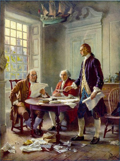
I was off last week from the blog, gallivanting around the northeastern states for personal vacation time mixed with research for my historical fiction novel about the American Revolution. The highlight of the research portion of the trip was undoubtedly a stop made in Philadelphia. I had planned for a one-on-one tour with an historian, Bill Ochester, to determine what was where in 1776.

Imagine my delight to discover Bill plays Ben Franklin. He plays him at reenactments, readings of the Declaration and Constitution, and various school presentations among others.  As if with a paint brush in his hands that removed the years, he walked me through Philadelphia as it may have been in 1776. In the words of Elton John, “It’s Philadelphia Freedom. I love, love, loved it. Yes I do!”

I learned in 1776:

• The whole of town was about eight by six city blocks in total.
• Houses were built on plots of about one acre and surrounded by gardens.
• Church bells were rung often, sometimes to ward off lighting and evil.
• The streets were swept to keep them clean.
• Elfreth’s Alley existed. Still does. It is the oldest intact residential block in the country.
• Taverns abounded for food, coffee, drink and to conduct business. (Some estimates say one per every 125 people.)
• There were 30,000 people living in what became the capital of the states. (=240 taverns.)
• The tower on Christ’s Church was funded by Ben Franklin. Not because he was religious, but so he could have unlimited access to perform  electrical experiments. Shocking.

Click on the thumbnails for enlargements and descriptions.

Jefferson wrote in his books!

As part of a presentation to my DAR group, I got to touch and hold this book of Patrick Henry’s in which he glued a bookplate and scrawled his name multiple times. Jefferson marked his books a different way.

As a lover of books and history, I am fascinated by the library collection of Thomas Jefferson. Over six thousand of his books became the Library of Congress. Terribly, in 1851 a fire reduced it to 2,465 volumes, and one-by-one, the Library of Congress has sought to replace the lost books as best they can. But those new acquisitions don’t always bear the mark of Jefferson’s library.

Bookplates, small paper panels glued into the inside cover or first page, were common in the 18th and 19th century. Books were costly treasures, definitely not 99¢, and so owners inserted custom engraved bookplates, and often signed them.

However, the bookplate wasn’t for Jefferson. During his lifetime, books were hand-printed and bound in small sections called signatures, and then those signatures were stitched together into the book. To ensure those signatures were put in the right order, each one had a tiny letter stamped on the bottom of the first page. “A” for the first signature, “B” for the second signature, “C”, etc.

In his books, Jefferson cleverly hand wrote a “T” before the small imprinted “J” and sometimes a “J” after the “T.” Nothing more. I can just see it. Jefferson, sitting alone in his study, tongue in the corner of his mouth, inking in a small “T” or “J” and nothing more. Smirking. It makes him seem mischievous and not just a little cunning.

Do you write in, or mark up your books as your own? How?

The bookplate of George Washington and others can be seen at Bookplate.org.
Learn more about Jefferson’s collection on display now at the Library of Congress in Washington, DC.


First Friday: Niki Sebastino, Design Geek{ess}

Niki Sebastino, the ultimate design geek{ess}, and her assistant, “Merri.”

I first met Niki over ten years ago while we were both at a small agency in Southwest Virginia. A designer and production artist, I recall her being two things: funny and curious. Ten years later, she’s not just a designer, but has also taught herself to become a programmer, and so she has shown me a fine example of someone who built a new life for herself.

She is about to begin a new job with a major corporation in their IT development department, and she has her own freelance web programming company, Design Geek{ess}. Although she developed herself in new ways, some things haven’t changed.

We have worked together on several projects, and those two traits I originally saw in Niki are better than ever. Her curiosity drove her to learn new skills, and it has allowed her to reach out for more information–either to online chat groups, other programmers, clients, or online resources–when the work requires it.

Her sense of humor, evident in any conversation, makes her really accessible and small hiccups in projects easily overcome. She is the first to admit she’s a total geek, and she plays with jquery, analytics, new plug-ins and widgets like a kid with a new puppy.

As the lead programmer on my new project, 224Pages, Niki quite frankly steals the show. The design might be mine, but it’s the magic of her programming that allows the site to read like a book.

Below is an image of Niki’s own site, self-programmed of course. Her “What?” section contains a portfolio of her great websites.

What’s not in a trailer?

By trailer I mean book trailer not a double-wide (What’s not in a double-wide is me in Daisy Dukes drinking a beer.) What authors and publishers are doing with mini movie-like previews of books ranges wildly. Here we’ll review what not to include.

Too many words
Darling, now is not the time to wax on. You have one or two minutes to impress, so the writing on the screen or the voice-over better be succinct. (Please, no authors at home using hand-held cameras saying “I wrote this because…”.) Sum up and sell the story.

Spoilers
As a friend of mine used to say while playing Kanasta, “Chest your cards, girls, chest your cards.” Pitch just enough so readers will want to buy the book. Why buy the cow…

Stolen Stuff
I love Yo-Yo Ma but I can’t use his music. Make sure you have the rights to images, music, videos and even fonts by purchasing them for a small fee from reputable stock websites and sources. The music on Bonjour 40 cost $39 and is it mine to use? Yo-Yo betcha.

BlahBlah
It’s tempting to list where to buy the book, reviews, available formats, etc. This is not a used car ad. Most likely the trailer will reside on your website, on Amazon, or in digital press kits with other details, so add a quote or two, but keep the blahblah to a minimum.

Credits
You aren’t Ron Howard. Think of these as commercials, and unless you’re selling book trailers or giving credit to live actors, focus on the book.

A great sampling of trailers can be found on BookRiot. Stay tuned for more trailer information soon…

Public Domain images like this one of Ron Howard and Henry Winkler dancing on “Happy Days” can be a great source, too. This work is in the public domain in that it was published in the United States between 1923 and 1977 and without a copyright notice. Wikimedia Commons is the source.

Posted in Blog | Comments Off on What’s not in a trailer?

Throwing Back the (Book) Covers

Confession: I have not read any of the Fifty Shades books. Part of my hesitation is because I have judged those books by the covers. To me, those sleek, modern covers quite simply lack thoughtful or artful design.

The all-grey palette and the simplified layout work for the small icons we see online. However, too much space at the top isn’t balanced with the space at the bottom, so the “#1 Bestseller” line lies too close to the edge of the book. The dull and forgetful Courier-esque type is squeezed tightly against images that hog the layout and are rendered with some of the worst drop shadows in history.

Take a look at those handcuffs (an image in contrast with the word “freed” in the title). How does light coming from the right cast a shadow to the right? It should be on the left. The shadow is also so wide the heavy metal cuffs are actually floating. Look at any object on your desk to see what I mean.

What does design say before you read? Poor layout = poor writing. Thoughtful layout = thoughtful read. Maybe I’m wrong and the covers have drawn in readers, but I suspect sales aren’t handcuffed to the design. I think sales are up because people historically like a scandalous tale, and they are seeing their married friends come into work with smiles on their faces.

Based on the below book covers, I think I’ll pass on the shades and pick up an old copy of Lady Chatterley’s Lover instead.

This cover design balances white space, highlights the title, and the color in the Signet logo matches the woman’s hair so the eye is drawn down across the book title and author’s name.
Book covers were once considered art. Lucy McClaughlan did this illustrated design. Her other work is in private collections and the Victoria and Albert Museum, she’s rendered murals on buildings, and was listed in “The 100 Leading Figures in Urban Art.” (I wonder what Doris Lessing would think of dear James?)

© 2024 Karen A. Chase. Collection of data from this website is GDPR compliant, and any information you may have about data collection can be found in our privacy policy.