First Friday: Niki Sebastino, Design Geek{ess}

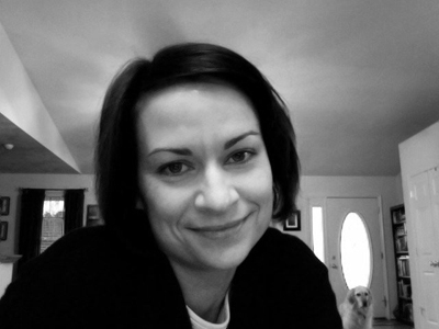
Niki Sebastino, the ultimate design geek{ess}, and her assistant, “Merri.”

I first met Niki over ten years ago while we were both at a small agency in Southwest Virginia. A designer and production artist, I recall her being two things: funny and curious. Ten years later, she’s not just a designer, but has also taught herself to become a programmer, and so she has shown me a fine example of someone who built a new life for herself.

She is about to begin a new job with a major corporation in their IT development department, and she has her own freelance web programming company, Design Geek{ess}. Although she developed herself in new ways, some things haven’t changed.

We have worked together on several projects, and those two traits I originally saw in Niki are better than ever. Her curiosity drove her to learn new skills, and it has allowed her to reach out for more information–either to online chat groups, other programmers, clients, or online resources–when the work requires it.

Her sense of humor, evident in any conversation, makes her really accessible and small hiccups in projects easily overcome. She is the first to admit she’s a total geek, and she plays with jquery, analytics, new plug-ins and widgets like a kid with a new puppy.

As the lead programmer on my new project, 224Pages, Niki quite frankly steals the show. The design might be mine, but it’s the magic of her programming that allows the site to read like a book.

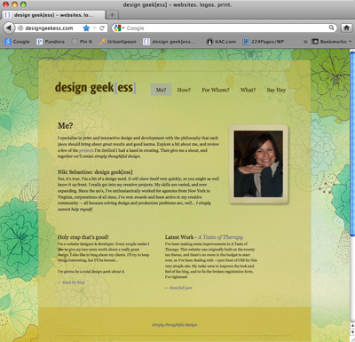
Below is an image of Niki’s own site, self-programmed of course. Her “What?” section contains a portfolio of her great websites.

What’s not in a trailer?

By trailer I mean book trailer not a double-wide (What’s not in a double-wide is me in Daisy Dukes drinking a beer.) What authors and publishers are doing with mini movie-like previews of books ranges wildly. Here we’ll review what not to include.

Too many words
Darling, now is not the time to wax on. You have one or two minutes to impress, so the writing on the screen or the voice-over better be succinct. (Please, no authors at home using hand-held cameras saying “I wrote this because…”.) Sum up and sell the story.

Spoilers
As a friend of mine used to say while playing Kanasta, “Chest your cards, girls, chest your cards.” Pitch just enough so readers will want to buy the book. Why buy the cow…

Stolen Stuff
I love Yo-Yo Ma but I can’t use his music. Make sure you have the rights to images, music, videos and even fonts by purchasing them for a small fee from reputable stock websites and sources. The music on Bonjour 40 cost $39 and is it mine to use? Yo-Yo betcha.

BlahBlah
It’s tempting to list where to buy the book, reviews, available formats, etc. This is not a used car ad. Most likely the trailer will reside on your website, on Amazon, or in digital press kits with other details, so add a quote or two, but keep the blahblah to a minimum.

Credits
You aren’t Ron Howard. Think of these as commercials, and unless you’re selling book trailers or giving credit to live actors, focus on the book.

A great sampling of trailers can be found on BookRiot. Stay tuned for more trailer information soon…

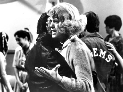
Public Domain images like this one of Ron Howard and Henry Winkler dancing on “Happy Days” can be a great source, too. This work is in the public domain in that it was published in the United States between 1923 and 1977 and without a copyright notice. Wikimedia Commons is the source.

Posted in Blog | Comments Off on What’s not in a trailer?

Throwing Back the (Book) Covers

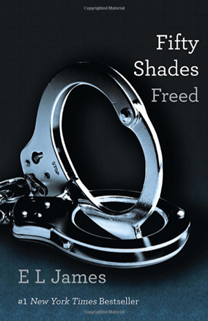
Confession: I have not read any of the Fifty Shades books. Part of my hesitation is because I have judged those books by the covers. To me, those sleek, modern covers quite simply lack thoughtful or artful design.

The all-grey palette and the simplified layout work for the small icons we see online. However, too much space at the top isn’t balanced with the space at the bottom, so the “#1 Bestseller” line lies too close to the edge of the book. The dull and forgetful Courier-esque type is squeezed tightly against images that hog the layout and are rendered with some of the worst drop shadows in history.

Take a look at those handcuffs (an image in contrast with the word “freed” in the title). How does light coming from the right cast a shadow to the right? It should be on the left. The shadow is also so wide the heavy metal cuffs are actually floating. Look at any object on your desk to see what I mean.

What does design say before you read? Poor layout = poor writing. Thoughtful layout = thoughtful read. Maybe I’m wrong and the covers have drawn in readers, but I suspect sales aren’t handcuffed to the design. I think sales are up because people historically like a scandalous tale, and they are seeing their married friends come into work with smiles on their faces.

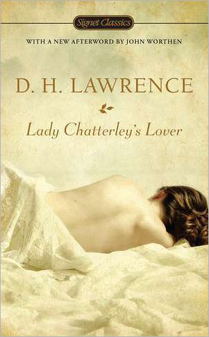
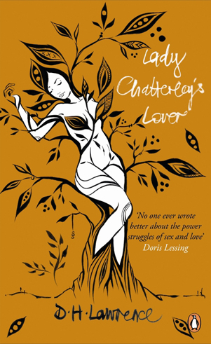
Based on the below book covers, I think I’ll pass on the shades and pick up an old copy of Lady Chatterley’s Lover instead.

This cover design balances white space, highlights the title, and the color in the Signet logo matches the woman’s hair so the eye is drawn down across the book title and author’s name.
Book covers were once considered art. Lucy McClaughlan did this illustrated design. Her other work is in private collections and the Victoria and Albert Museum, she’s rendered murals on buildings, and was listed in “The 100 Leading Figures in Urban Art.” (I wonder what Doris Lessing would think of dear James?)

Word-sticklers

Last week I was having dinner with my friends Kelly and Sundra, two women who are well-educated, well-read and excellent writers with blogs of their own (click on their names to find them). Odd then, how we all openly admitted to incorrectly spelling some of the simplest words, or as I call them, word-sticklers.

For me, the words are necessity and surprise. Even now, I waited while typing for spell check to correct me. Is there one ‘s’? Is there a second ‘r’ in surprise, because when I type it all I can hear in my head is Gomer Pyle, and I think it looks stupid.

In a letter last week I was texting the sentence: “We will have to asses the situation.” Woa. That’s not the correct spelling for assess. So I did what I call a Porky Pig. I said to myself, “Is it asses, asess, assess? Oh just type evaluate.”

My friends were kind and admitted they too had issues. For Kelly it was the word whether. When she types it, sometimes she doesn’t know whether to use that version, or weather to use this version. For Sundra, it was the word restaurant.

“I always stick that ‘u’ in the wrong place?” she said.  I’m sure you weren’t  the only one dining out that night who does, Sundra.

I was so happy they admitted it, for it makes it easier now when I do find a word that flabbergasts me. I know I’ll encounter them again. Surprise, surprise, surprise!

Do you have word-sticklers in your life?

Misspellings make me want a glass of wine. Check out this lovely photograph taken by Ms. Kelly herself for her new blog Austen Hill. (Chronicling the adventures of a 19th century girl living in a modern world…)

First Friday: London Olympic Art

Graffiti artists abound in London. Here, an image taken on the South bank of the Thames in an area where graffiti is allowed, was done for the wedding of Prince William and Kate.

London likes to dress up for special occasions. In honor of the 2012 Summer Olympics, my First Friday is dedicated to some of the artistic endeavors inspired by the games. (I will not give praise to the disastrous 2012 logo and mascots only McDonald’s could love.)

Dress
Could the styles of uniforms for the athletes be any more vogue? Stella McCartney designed the stunning UK team’s Adidas gear, making me wish I biked for Britain. (Meanwhile, Ralph Lauren designed the clothes for the USA team… but they were made in China. Doh!)

Hat
Londoners love hats, so the Mayor dressed up a few of the city’s iconic statues with designer creations that play homage to the flag and even to SPAM (Spam, Eggs, Spam and Spam).

Olympic Park Art
Aside from the stadium which transformed the historically grubby east end of London, the Olympic Park is home to one-of-a-kind art installations commissioned for the park, including a giant mirrored display of the word RUN. See more in the official Art in the Park brochure.

Graffiti
London is among the best in the world for beautiful street art, and its graffiti artists have stepped it up for the Olympics, like this perfect placement high-jumper by Banksey. Sadly, the International Olympic Committee and the British Transport Police (BTP) have been fiercely removing graffiti they feel doesn’t fit the Olympic brand or is too close to the venues. Banskey’s work is fighting to stay.

See more in this photo gallery of Olympic inspired art installations in London.

Posted in Blog | Comments Off on First Friday: London Olympic Art

Where Do You Research?

This week I was asked where I’ve been conducting research for my novel about the American Revolution. My response was, “would you like that alphabetically or chronologically?” Certainly, I’ve worked with the traditional sources like libraries and archives. However, historical fiction isn’t like non-fiction where you must always go in search of proof. Sometimes it’s in search of opportunities for fiction.

Conflicting viewpoints are one way to find it. Wikipedia. Blogs. Historians. Those resources are filled with proofs and facts, but also opinions, theories and undocumented sources. Where two ideas collide gives me the opportunity to draw out what would happen if one of those two ideas was correct.

I also search for holes. Historical documents, textbooks (especially elementary and high school versions), and websites by historic hobbyists don’t always provide the same level of facts. Where I find a repeated dearth of details with regard to a place, event or time, is a hole I can fill with… well… stuff I make up.

I also research for the senses. I rarely find those in a book, so I travel to actual locations. I want to hear a place, smell it, touch trees, or look at the view – even if they’ve changed. There’s often a nearby museum, and there’s always some historic-ranger-docent guy who loves the place or whose grandpa told stories. I love them. After all, that’s what I do. Tell stories.

How do you conduct historical research for fiction?


Below are my photos from Stratford Hall, about an hour north of Richmond. It was home to the Lee family, who contributed two signers to the Declaration of Independence, and the general of the south, Robert E. Lee.

Author Websites

If you’re a new author or a self-published author, you need one. Even JK Rowling and Wilbur Smith have them. But what makes for a good author site?

Above all, the site must provide details about your book(s) and also contain links to retailers for purchasing. However, it’s also to help readers connect with you. The website URL should be YourAuthorName.com and not YourBookTitle.com (unless of course you plan on being a one-hit wonder). Assuming you’re not, the website is your library and forum, so set it up as such.

Websites for authors don’t have to, and probably shouldn’t be, large. You want to write books, not update websites. Navigation tabs at minimum should include:
About – Books – Contact

The optional stuff is where your readers get to interact with you, and that’s crucial in gaining a following. So additional navigation can include things like:
Book Trailers/Video – Press/News – Blog – Photo Gallery – Twitter Feed

Contact info is tricky. Many authors work from home, so listing a phone number and address can feel creepy, especially for the gals. So provide a contact form for readers. Links under your “contact” navigation can include all the social media accounts you have, so readers can connect with you there as well:
E-mail – Facebook – Twitter – Goodreads – RSS Feeds, etc

What other content do you think author sites should have?
Please share examples of author websites with great features or functionality.

When building my author site, I designed it so the Eiffel Tower background behind the middle section can change as new books are released, giving the site a fresh feel and PR functionality, while content stays the same.

Posted in Blog | Comments Off on Author Websites

Guest Post on Steena Holmes’ site

Fellow Canadian and writer, Steena Holmes, invited me to contribute an article on the importance of writer characters with emotion. I wept. Or rather I wrote about the importance of crying. So drop in on her lovely site, grab a box of tissues, and click through to my article, “My character cried,” I sobbed. Thanks Steena for the invite.

Posted in Press | Comments Off on Guest Post on Steena Holmes’ site

Bookmaking Part Two: Early Editing

A visual representation of how I felt after receiving early editing comments from my editor. Oh deer, oh dear, oh deer.

In Bookmaking Part One I mentioned working with editors early on to prevent major manuscript overhauls. That post received several comments, so I’ll share a story about how early editing helps with revisions.

I’m writing an historical fiction piece. It’s filled with facts as well as fictional and non-fictional characters. I built character profiles, outlined the fairly complicated plot, and wrote the first chapter. Upon working with the editor who specializes in historical fiction, she sent back concerns and positive comments (as a nice editor will), and announced I was building a great YA novel. What?! Oh no. Adult historical fiction was my intent.

I’ve made my part of my living as an advertising copywriter where I must compress pages of information into smaller bite-sized pieces. So now I wasn’t giving nearly enough weight to details that historic fiction readers truly love. And the POV I had chosen, first-person, would limit the descriptions I could include of the 1776 time-period. Thank heavens I had only twenty pages. Can you imagine trying to go back through three hundred pages to make those kinds of changes?

While some writers like to finish the manuscript before it is edited, it’s important to find a freelance editor who works with your style. Not every editor wants to work with bits and pieces, but if they do, they’ll see the trees before you enter the forest, and can outfit you with the right gear to come out the other side.

Posted in Blog | Comments Off on Bookmaking Part Two: Early Editing

First Friday: Matt Flowers’ Landscapes

A Matt Flowers Landscape

Imagine a mountain top. Way up high. With old craggy rocks springing forth with glorious evergreens reaching for the sun. The above artwork is part of a collection by Richmond artist, Matt Flowers. But all is not as it appears. It is not a photo of place. It’s a place created by Matt that and your interaction with it makes you feel huge while at the same shrinking you in an Alice in Wonderland kind of way.

Using driftwood, rocks, moss, enamel, paint and detailed hand work that is surely going to give him early-onset crows-feet, Matt is a sculptor of landscapes that are driven by his photographic eye. In taking pictures of Matt’s work for this post, I quickly realized I was not capturing one of the most essential and remarkable elements of his sculptures. Scale. So I included a frame of reference to help you comprehend the size through a series of images.

Using the found elements and adding in tools like magnifying glasses and backlit screens, Matt engages the viewer to discover life-like imaginary worlds. Some of his pieces use antique lenses tucked into handcrafted boxes mounted on vintage tripods to create small dioramas that make the viewer feel as if they’ve dropped into an H.G. Wells-like world where nothing is as it appears. His tiny details create landscapes that upon closer inspection feel larger, giving the viewer a magical glimpse into another place both of this world and of Matt’s imagination.

This gallery of images of his sculptures better explains the work, and for more information visit Matt Flowers’ website.

Posted in Blog | Comments Off on First Friday: Matt Flowers’ Landscapes

© 2024 Karen A. Chase. Collection of data from this website is GDPR compliant, and any information you may have about data collection can be found in our privacy policy.